Think about the last time a brand caught your attention. Before reading a single word, you probably noticed its colour. Maybe it felt calm and trustworthy, or it just didn’t feel right. And you moved on without even thinking why.
That instant reaction is not random. But this is a colour psychology in branding. It’s all about how colours quietly shape emotions, influence decisions, and build first impressions long before logic steps in. In branding, colour isn’t just design. It’s personality. It’s the mood. It’s a memory. And you’ll realise it’s everywhere once you start noticing it.
Let’s explore how color psychology really works in branding and helps you gain viewers’ trust.
Why Colour Can Change How a Brand Feels in Seconds
Humans don’t process brands like machines. We feel first, think later. That’s why colour is so powerful, it speaks to emotion instantly.
Without reading anything, colour can:
- Make a brand feel trustworthy or doubtful
- Make it feel premium or budget-friendly
- Make it feel modern or outdated
- Make it feel exciting or calm
That’s also why brand logo colours are such a big deal. They’re not picked randomly, they set the emotional tone of everything a brand stands for.
And here’s the interesting part: most people don’t even realise it’s happening.
The Hidden Language Behind Brand Colours
Every colour tells a quiet story. Not a literal one, but an emotional one, your brain understands instantly.
Blue feels like trust, you don’t have to question
Blue is the colour you see when a brand wants you to relax and believe them.
It feels:
- calm
- stable
- professional
That’s why so many banks, tech companies, and healthcare brands use it. It removes doubt and replaces it with quiet confidence.
Red feels like an urgency you can’t ignore
Red doesn’t wait. It pulls your attention immediately.
It feels:
- bold
- emotional
- energetic
That’s why it’s everywhere in food brands, promotions, and entertainment. It forces you to make decisions rather than think.
Yellow feels like a smile in colour form
Yellow is light, warm, and easygoing.
It feels:
- happy
- friendly
- welcoming
It’s the kind of colour that makes a brand feel approachable.
Green feels like balance and breathing space
Green is calm in a natural way.
It feels:
- healthy
- stable
- refreshing
It’s often used by eco brands, wellness companies, and financial services because it quietly signals growth and safety.
Black feels like confidence without noise
Black doesn’t try to impress; it just is impressive.
It feels:
- premium
- powerful
- elegant
Luxury brands adore it because it instantly creates a sense of exclusivity when representing the brand.
White feels like clarity and simplicity
White is not empty; it’s intentional space.
It feels:
- clean
- modern
- minimal
It helps everything else in a design stand out without distraction.
How Smart Brands Actually Use Colour (It’s Not Guesswork)

Good branding doesn’t start with “What colour looks nice?”
It starts with “What should people feel?”
That’s a completely different mindset.
When brands choose colours properly, they think about:
- Personality: Is it bold, calm, or playful?
- Audience: Who are the targeted audience? What do those people respond to?
- Positioning: Is it expensive, inexpensive, or ruinous?
- Consistency: Will this colour work everywhere from logo to social media?
Because here’s the truth:
Even a perfect colour fails if it’s not used consistently.
That’s why strong brand logo colours become a signature over time. People don’t just recognise the logo, they recognise the feeling it gives.
Why Colour Matters Even More Online
Attention is fast and unforgiving in the digital world.
A user visits a website or social page and decides in seconds:
- Stay or leave
- Trust or doubt
- Explore or ignore
And before anything is read, colour is already influencing that decision.
This is where colour psychology in branding becomes extremely powerful. It silently improves:
- first impressions
- engagement
- brand recall
- conversion behaviour
In short, colour helps decide whether your brand gets a second look, or not.
When Colour Becomes a Real Brand Strategy
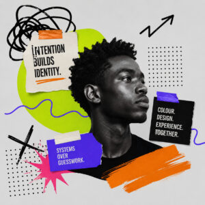
The difference between average branding and strong branding is simple: intention.
Some brands pick colours.
Strong brands build systems around colours.
That’s what turns design into identity.
But strategy alone isn’t always easy to execute. Many businesses know what they want but struggle to translate it into a complete visual system that actually works across platforms.
That’s where expert help makes a difference.
Platforms like Comright help businesses turn ideas into structured branding systems, where colour, design, and user experience work together instead of feeling random or disconnected.
Conclusion
Colour is never just colour in branding. It’s an emotion. It’s perception. It’s the silent first impression that shapes everything that comes next.
When you understand colour psychology in branding, you stop choosing colours based on preference. And start choosing them based on meaning.
And that small shift changes everything about how people see your brand.
If you’re ready to build a brand that actually feels right to your audience. Explore professional branding support at Comright and start shaping a brand identity that people remember instantly.